Amy Krane is an Architectural Color Consultant, here in the Hudson Valley.
Following is Part Two of an interview with Trixie’s List.
For more information about Amy Krane Color, please visit AmyKraneColor.com
If you would like to read Part One, please click here.
Q: Are there colors that are “in” for the season/year? What is the avocado green or harvest gold of today?
Amy Krane: Every year, the major paint companies release their Color of the Year (CoTY). They say sales increase for those colors during the subsequent year.
The 2023 CoTY for Benjamin Moore was Raspberry Blush, which is actually a deep orange, despite its name. It’s a highly saturated bold color. It’s the kind of color you use sparingly indoors and outside; it’s best for a door.
Sherwin-Williams’ CoTY is called Redend Point which is an adobe/clay/pink.
Greens are still strong. Many companies chose them as Color of The Year for 2022. All of the color forecasting scuttlebutt is that colors are on a warm trend now, so it’s beige instead of white, pink, clay and caramel, etc.
Q: Do you have your own personal favorite colors? If so, would you like to share them?
Amy Krane: It’s like picking a favorite child. No can do! I like both clear and muted colors from every color family. I generally don’t put highly saturated colors on my walls – they’re just too bold for my vibe. I love wallpaper and having pattern around me. In fact, we just released our latest episode of our podcast, Let’s Talk (paint) Color last night and it’s about wallpaper. Putting pattern up is a great way to get your color fix in!
I gravitate towards colors which are complex and hard to identify as belonging to one color family or another. For instance, I like colors such as millstone gray and pearl gray – neither of which I would consider a gray. I have no gray in my home.
Q: Have you ever cautioned someone AGAINST their color choice?
Amy Krane: Yes! Yesterday. I had my kick-off call with a new client who bought a lake house in Pittsfield. She had some nice ideas, but her direction for how to paint the trim just didn’t sit right with me and I didn’t think it would achieve the look and feeling she wanted. I am careful to stay within the lane of sound color advice based on what I know about the human response to color and how it behaves on architecture and in certain light. I keep my personal taste out of it because we all have different taste and I’m not here to foist mine on you – at least not until someone asks for it. I won’t tell someone what to like but I WILL tell them when two colors clash, or are too saturated for an interior, or will cause an unbalance in the flow of their space.
Q: If you’re looking to sell a house, what are the best colors to use? Or, what are the best colors for a rental unit?
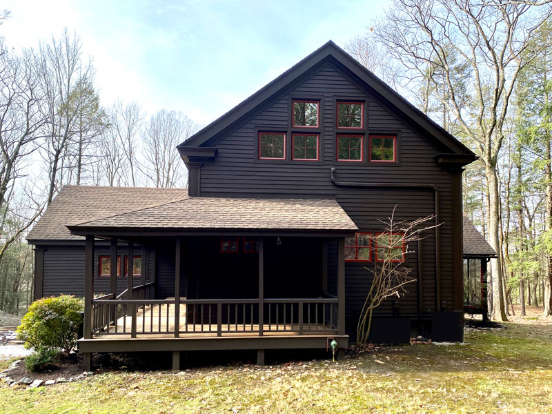
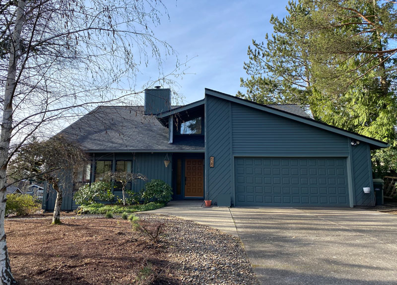
Amy Krane: I think you need to know your market. Trends for exterior colors are very dark now, including black, but I wouldn’t put that on a neighborhood home. For instance, it’s not the right direction for a more suburban house.
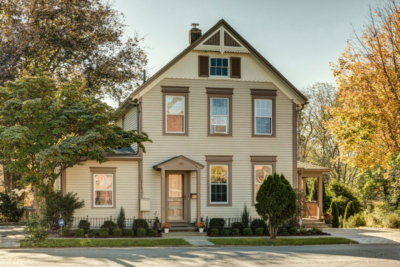
For exteriors, go classic for your style of architecture, many of which have classic color palettes associated with them. Here comes some shameless self promotion – if you’re planning to sell your home, you will most likely recoup (plus some), the cost of a color expert to help you get ready for sale. Chances are you will reap a higher sale price…..just because of great paint colors!
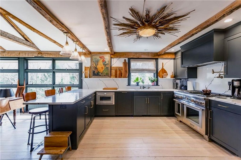
In terms of interiors, while you can go the all “neutrals” route- gray, beige, white, etc, I think if you stay soft and light you’re always good. People respond to light, and a color which darkens a room, though trendy, colors like navy won’t be for everyone. I would say if you let your kids pick their wall colors and they are pretty wild, like purple or fuchsia, you might want to put a few coats of something more tame on top of it. Lots of people have a hard time envisioning what a space would look like in a different color and sometimes there’s a negative knee-jerk reaction. It would be very sad to lose a house sale due to a poor color choice – which is an easy fix.
Speaking of knee-jerk reactions, that’s my reaction towards colors like linen white, which was the builder’s beige choice for eons for rentals. If renting, go light, go neutral, and make sure your colors work well with the material finishes in the place, like your cabinets and counters. When in doubt, always make the place look clean and fresh, for instance, an off-white that doesn’t lean yellow or a pale, pale gray is fine.
Amy Krane is an Architectural Color Consultant, here in the Hudson Valley.
Following is Part Two of an interview with Trixie’s List.
For more information about Amy Krane Color, please visit AmyKraneColor.com
If you would like to read Part One, please click here.


1 thought on “Amy Krane: Architectural Color Consultant”